
Wix Website from Scratch - Grid Gallery
In this tutorial, we will add a gallery to our Wix website, which we have created from a blank template. Starting from scratch is a great way to learn the basics.
Unlike the Wix templates that are not interchangeable, you can switch gallery types for a new look at any time. There are many types of galleries, from Masonry grid to Honeycomb. Each gallery has its own features. Let' s take a look at the basic Grid (portrait) gallery.
Unlike the Wix templates that are not interchangeable, you can switch gallery types for a new look at any time. There are many types of galleries, from Masonry grid to Honeycomb. Each gallery has its own features. Let' s take a look at the basic Grid (portrait) gallery.
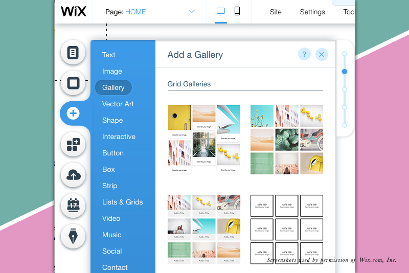
- Click the Plus icon in the left menu and choose Gallery from the list.
- Hover over each gallery thumbnail to see a preview and description.
- Now, drag the Grid gallery to the page.
- Use the Resize Handles to resize the grid as you wish. I resized the grid to the 980 page width.
At this point the gallery has some placeholder images. Let's keep them for now and work on customizing the gallery settings for our needs.
Grid Gallery Settings
Image Scaling - You have the option for your image to be cropped or scaled to fit within the frame. The Autocrop setting will automatically crop the images to fit the frame and the Fit option will resize the image to fit within the frame.
When Clicked - You have three options for what happens when a gallery image is clicked. One option to for nothing to happen. The second is to have the image open as a pop up. The third is to open a link. Most of the time, the pop up is a good choice because the image is displayed at a larger size. But if you want to send the visitor to another page, use the A Link Opens option. - Select the Gallery and click the Setting icon in the pop up menu.
- In the Grid Settings window, find the How Do Images Behave section. Choose Autocrop or Fit.
- In the When Clicked section, set one of the three options.
Gallery Design
As mentioned above, you can switch gallery designs at any time. But let's continue by customizing our grid design. For the grid design, we can customize the border, corners, shadow and text. - With the gallery still selected, click the Design icon (paint brush).
- For the Border settings, we can change the color, opacity and width of the border. Let's keep the default setting of the width set to 0 and therefore no border.
- Corner Radius - Click the icon for the Corner Radius and set the top left corner radius as you like. As the link icon indicates the other three corners will update to match.
- Shadow - Select the Shadow icon. To add a drop shadow, click the Enable Shadow toggle and set the Angle, Distance, Size, Blur and Color/Opacity for the shadow.
- Text - Click the T icon to set the options for the Title, Description and Other text settings. Let's change the text from the default to our Paragraph 1 text theme. Repeat for the Description text.
Layout Settings
For the Grid gallery design, we can control the number of columns and rows for the thumbnails. We can also control the spacing between thumbnails and how the text is displayed over the image. - With the gallery still selected, click the Layout icon from the pop up menu.
- Use the slider to set the number of columns and rows. Adding more columns and rows will result in smaller thumbnail images in the grid.
- You can use the Spacing slider to increase the amount of pixels between thumbnails. Adding more space will reduce the size of the thumbnails.
- Under the sliders is the text alignment section. You have the option for the text to display left, right or center.

Related Articles
Editor's Picks Articles
Top Ten Articles
Previous Features
Site Map
Content copyright © 2023 by Diane Cipollo. All rights reserved.
This content was written by Diane Cipollo. If you wish to use this content in any manner, you need written permission. Contact Diane Cipollo for details.